Accordions
How to use accordions to improve the organisation and readability of long-form content.
Accordions are commonly used as a way to present content in a collapsible and expandable format. This allows users to quickly and easily access the specific information they need without being overwhelmed by too much information on the page.
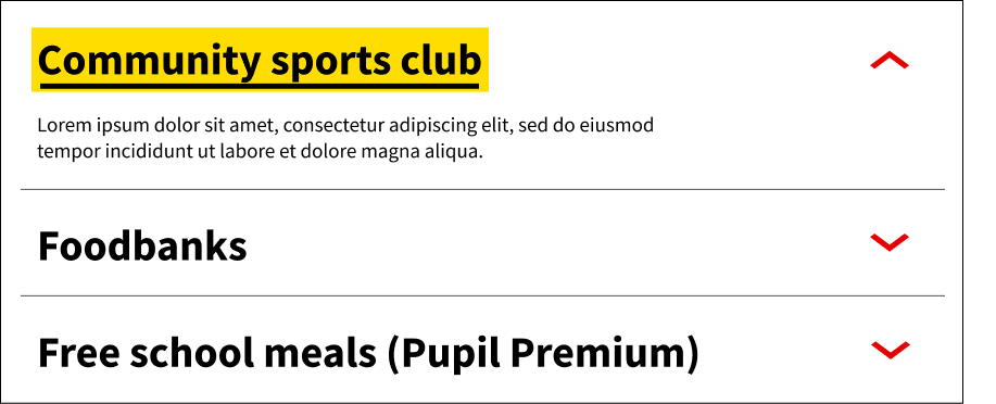
Image
When to use an accordion:
When deciding whether to use an accordion, it's important to consider the user's needs and whether an accordion would be a good fit for the content that is being presented.
Here are some guidelines to keep in mind:
- They should be used when a user needs to see an overview of related content, show and hide relevant sections, or compare information that's relevant to them.
- Accordions can be particularly useful for presenting long lists of FAQs or product features
- They can also work well for users who need to complete familiar tasks quickly
- Include icons as visual cues so that users are aware of how to interact with the accordions
When not to use an accordion:
When used properly, accordions can help users navigate content more efficiently. However, there are situations where an accordion might not be the best option.
- Consider the following points before deciding whether to use an accordion:
- Avoid using an accordion if the content is critical and must be seen by all users. Since accordions hide content, users may miss important information if they don't interact with the accordion
- Do not put accordions within accordions, this will make content difficult to find on a page
- Avoid using and accordion for content that may significantly slow down the page loading speed
Accessibility:
It is important to consider the following points to ensure that the accordions are accessible for all users:
- Label icons appropriately in alt text so that users with screen readers can understand the function of the icon. For example, using "Expand" or "Collapse" for an accordion icon
- Make sure the accordion is fully operable with a keyboard, including the ability to expand and collapse the sections using the keyboard
- Test the accordion with a screen reader to ensure that it can be easily navigated and that all content is accessible
- Avoid using accordions for essential content, as they may not be immediately visible to some users
- Ensure that the accordion header is highlighted when clicked on, and that this highlight is visible to all users, including those using assistive technologies. This can help users understand which section they are currently viewing and improve the overall user experience