Layout
How to create balanced and functional layouts for Barking and Dagenham digital products.
Depending on the the screen size that our users use, our website will adapt its layout and design to ensure optimal user experience.
We recommend using specific breakpoints to switch between different column layouts, depending on the screen size and orientation.
Our development team will use media queries to ensure that the layout and design automatically adjust based on the screen size, maintaining readability and accessibility across all devices.
Desktop Screens:
We recommend using a two-thirds and one-third column layout as this is a highly effective approach for organising content on desktop screens. For desktop screens with large resolutions (e.g. 1440px and above), the two-thirds and one-third column layout can be maintained. For desktop screens with medium resolutions (e.g. 1024px to 1439px), the layout can be adjusted to a two-column layout with roughly equal width.
By using this layout, we can create a more balanced and readable design that makes it easier for our users to navigate and interact with our content.
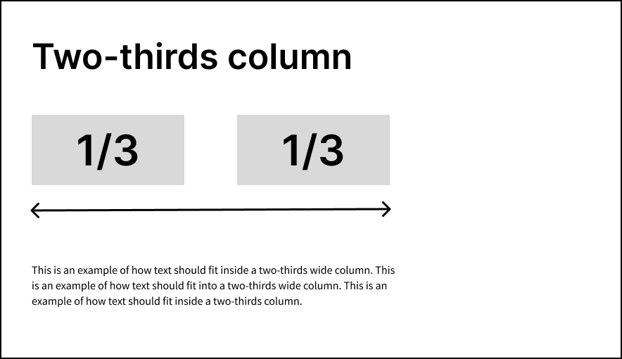
Two-thirds column:
A two-thirds column layout can be ideal for displaying main text content such as resident information, blog posts, or long-form content.
Image
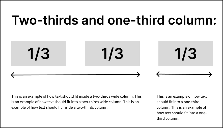
Two-thirds and one-third column:
A two-thirds and one-third column layout can be used to display the main body of text and related content, such as a table of contents, suggested pages, or other secondary content.
Image
Mobile Phone Screens:
For mobile devices, a single-column layout should be used for resolutions of around 480px and below. This will also ensure that we make the most efficient use of limited screen space.
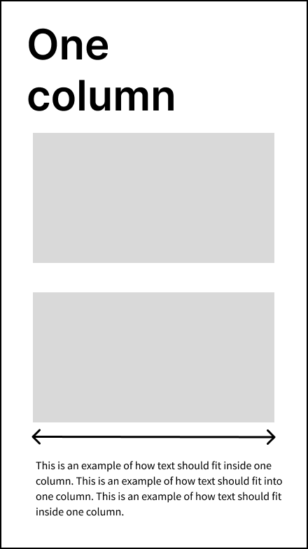
One column:
The layout, font sizes, and spacing should be adjusted to ensure that the content remains readable and accessible. For example, the two-thirds and one-third columns should be stacked vertically on smaller screens, with the content arranged in a single column.
Image

Tablet Screens:
For tablets in landscape orientation, a two-column layout with roughly equal width can be used for resolutions of around 768px to 1023px. For tablets in portrait orientation, a single-column layout should be used for resolutions of around 767px and below. This will also ensure that content is displayed in the most efficient way.
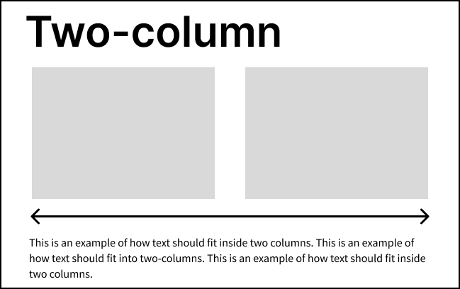
Two column:
When a tablet is in landscape orientation the content should accommodate a two-column layout with roughly equal width, making it suitable for displaying more content on the screen at once.
Image
One column:
When a tablet is in portrait orientation, the device's screen width is typically narrower and can make it more difficult to display a multi-column layout. Therefore, we recommend using a single-column layout for better readability and accessibility on smaller screens.
Image