Hover, Pressed and Focus States
How the appearance of elements should differ when being hovered, pressed or focused on.
Colour and contrast should be used to indicate which elements on the webpage are being focused on. For example, when a user tabs to an element with their keyboard.
Buttons:
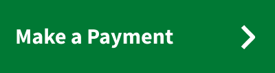
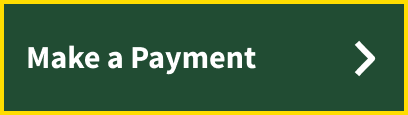
Call to Action Buttons
When focusing and pressing on buttons:
Colour: From Green #007934 to Dark Green #214C33
Text decoration: None
Border: Yellow #FFDD00
Examples:
|
Image
|
Image
|
Primary Buttons
When focusing and pressing on buttons:
Colour: From Dark Aubergine #320A4B to Purple #5A207E
Text decoration: None
Border: Yellow #FFDD00
Examples:
|
Image

|
Image

|
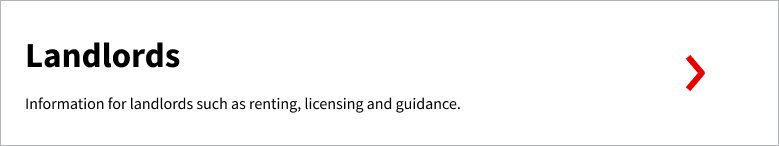
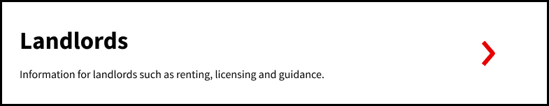
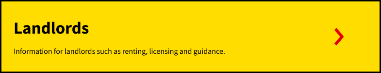
Content Boxes:
When focusing on content boxes with text:
Colour: None
Text decoration: None
Border: From Grey #B1B4B6 to Black #0B0C0C
Examples:
|
Image
|
Image
|
When pressing on content boxes with text:
Colour: From White #FFFFF to Yellow #FFDD00
Text decoration: None
Border: Black #0B0C0C
Examples:
|
Image
|
Image
|
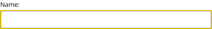
Forms:
Input Fields
When focusing and pressing on input fields:
Colour: None
Text decoration: None
Border: From Black #0B0C0C to Yellow #FFDD00
Examples:
|
Image

|
Image
|
Radio Buttons
When pressing on radio buttons:
Colour: None
Text decoration: None
Border: From Black #0B0C0C to Yellow #FFDD00
Examples:
|
Image

|
Image

|
Linked Text:
When hovering over linked text:
Colour: Blue #1D70B8 (Text)
Text decoration: Blue #1D70B8 Bold Underline
Border: None
Examples:
|
Image

|
Image

|
When pressing on linked text:
Colour: Black #0B0C0C (Text) Yellow #FFDD00 (Background)
Text decoration: Black #0B0C0C Bold Underline
Border: None
Examples:
|
Image

|
Image

|